Damkar Typeface: A Web Designer’s Take on Stencil Typography
I was staring at a blank hero section, trying to decide whether the design felt too safe or too chaotic. The client wanted a boutique online store that felt industrial yet approachable—think raw materials meets modern lifestyle. We had great photography, clean white space, and a solid grid system. But the typography felt flat. It lacked that subtle edge that makes a user pause their scroll. That’s when I pulled up Damkar.
If you are a web designer, UI specialist, or digital product creator who has ever struggled with finding a display font that balances personality with readability, this is the kind of practical story for you. I tested Damkar across several layouts, from mobile-first landing pages to desktop editorial grids. Here is what I learned about using this unique Sans Serif font in real-world digital projects.
What Makes Damkar Different?
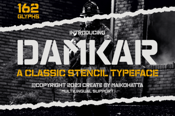
Damkar is characterized by its unique typography style, which features distinctive attributes, namely holes or cutouts present in each letter and symbol. This is the hallmark of a stencil font. Unlike standard sans serif fonts where every stroke is connected, Damkar breaks the continuity of certain characters. Visually, this creates a sense of structure, layering, and depth without adding heavy visual weight.
In digital design, we often chase "clean" aesthetics. Sometimes, however, clean can feel sterile. Damkar introduces a tactical, architectural mood to your layout. It feels engineered. When you place it over an image banner or use it as a header for a course sales page, it immediately signals precision and creativity. It is not just text; it is a graphical element that draws the eye through negative space.
Testing Readability in Hero Sections
The first test I ran was placing Damkar in a full-width hero section with a dark background image. My initial concern was legibility. Stencil fonts can sometimes become difficult to read if the cutouts are too aggressive or if the contrast against the background is low. However, Damkar strikes a careful balance. The gaps are distinct but do not fragment the letters so much that the brain struggles to recognize them.
Key takeaway: Use Damkar for short, impactful headlines. It works beautifully for one-word or two-word titles like "LAUNCH," "CREATE," or "DESIGN." When I expanded it to longer sentences, the scanning behavior of the user slowed down. The eye jumps from break to break, which disrupts the natural flow of reading. For body copy or long-form content, stick to a simple sans serif font or a clean serif font. Let Damkar be the accent, not the narrator.
Building Visual Hierarchy and Brand Trust
In web design, hierarchy dictates how users process information. Damkar naturally commands attention. Because of its decorative nature, it sits at the top of the visual hierarchy. I used it for section headings on a portfolio homepage to separate different project categories. The result was a site that felt organized and intentional.
Using a creative font like Damkar also affects brand perception. It suggests that the business behind the website pays attention to detail. For digital brands, agencies, or creative entrepreneurs, this font communicates a modern typography aesthetic that is both bold and refined. It adds a layer of professionalism because it shows deliberate stylistic choice rather than default settings.
- Hero Titles: High impact, immediate engagement.
- Section Headers: Clear separation of content blocks.
- Call-to-Action Areas: Can be used sparingly for button text if the phrase is short (e.g., "GET STARTED").
- Decorative Accents: Ideal for pull quotes or small captions.
Font Pairing Strategies for Digital Layouts
No font works in isolation. To make Damkar shine, you need a strong partner for your body text. Since Damkar is a Sans Serif font with complex internal structures, pairing it with a neutral typeface is essential. I paired it with a geometric sans serif for body copy on a coaching website. The simplicity of the body text allowed the stencil details of Damkar to stand out without competing for attention.
Alternatively, for a more editorial digital identity, you might pair Damkar with a high-contrast serif font. This combination creates a sophisticated look often seen in fashion e-commerce or luxury brand kits. The organic curves of a serif font contrast nicely with the rigid, cutout geometry of Damkar, creating a dynamic tension that keeps the design interesting.
Avoid pairing Damkar with other decorative fonts, such as script fonts or handwritten fonts. The visual noise will become overwhelming, and your users will struggle to find a focal point. Keep the supporting typography minimal, highly readable, and consistent.
Mobile Responsiveness and Small Screens
One of the biggest challenges in modern web design is ensuring fonts render well on mobile devices. On smaller screens, the cutouts in Damkar can sometimes merge or become indistinct if the font size is too small. I found that keeping the headline size above 32px on mobile provided the best clarity. For smaller UI elements, such as labels or tags, Damkar lost some of its character and started to look pixelated or muddy.
Best practices for mobile:
- Check contrast ratios: Ensure the font color stands out sharply against the background, especially on light backgrounds where the cutouts might let the background bleed through too much.
- Limit line length: Shorter lines help the eye track the broken strokes of the stencil letters more easily.
- Use responsive sizing: Scale the font size down gracefully, but consider switching to a simpler sans serif font for sub-headings on very small viewports.
Practical Applications Across Digital Products
Beyond websites, Damkar fits seamlessly into broader digital asset creation. If you are designing social media graphics for a campaign landing page, Damkar adds instant visual interest to Instagram posts or Pinterest pins. It works well for promotional banners where you need to grab attention quickly.
For course creators and SaaS founders, Damkar can be used in email marketing headers or webinar slides to add a touch of premium quality. It elevates the perceived value of the content. In logo design, it can serve as a powerful base for a brand mark, though ensure it remains legible at favicon sizes.
Technical Considerations Before Implementation
Before dropping Damkar into your project files, there are a few technical checks to perform. First, verify the included styles. Does the font family offer multiple weights? Having access to Light, Regular, and Bold variants gives you flexibility in establishing hierarchy. Check if there are alternates for specific letters that might change the aesthetic slightly.
Ensure you have the correct file formats for web delivery. Typically, WOFF2 is the preferred format for fast-loading visual content due to its compression efficiency. Test the font loading behavior to prevent flash of unstyled text (FOUT) or flash of invisible text (FOIT), which can disrupt the user experience during page load.
Finally, review the commercial font licensing. If you are using this for a client project, an online store, or a branded web template, make sure your license covers web embedding and commercial use. Using a free trial version in a live production environment can lead to legal issues. Investing in a proper commercial font license protects your work and supports the type designer.
Final Thoughts on Design Impact
Damkar is not a utility font; it is a statement font. It succeeds when used with intention. By treating it as a decorative element within a structured layout, you can create digital experiences that are both visually striking and functionally sound. Whether you are redesigning a blog, launching a new product, or refreshing a brand identity, testing Damkar in your hero sections and headers can add the missing layer of polish your design needs.